Client: Landing
Role: Senior Visual Designer
Credit: Pablo Domrose (illustrator) and Alexa Lemoine (Copywriter)
404 Error Page
Landing's original 404 page was a standard error page, and we saw an opportunity to infuse more personality into the brand. I collaborated with our illustrator and copywriter to explore different creative directions. We ultimately settled on the theme of "wandering into the wrong apartment," which aligned with our brand's tone. One version featured a couple cooking inside, a playful inside joke for the team since that image had been frequently used. This not only added a fun, familiar touch but also fit seamlessly within the overall brand narrative.


Client: Vanity Fair
Role: Art Director and illustrator
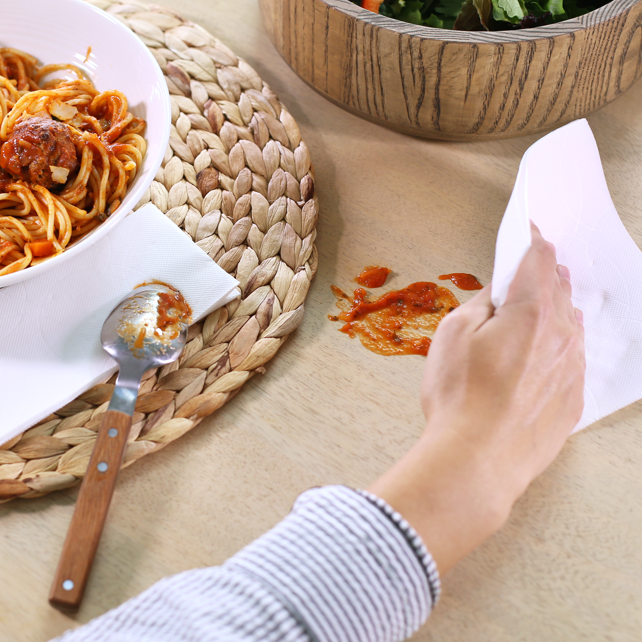
The elegance of a Vanity Fair® Napkin can offset a less-than-elegant moment and make any meal lovely.
Ask
Vanity Fair sought assistance with enhancing their social media presence and boosting Amazon sales for their Luxe Napkins and Extra Absorbent Napkins.
Solution
I developed concepts and illustrations to help clients easily visualize and understand my ideas, making it easier to get their buy-in. For promoting Vanity Fair napkins on social media and Amazon, I proposed showcasing the luxurious feel of Luxe Napkins, highlighting the absorbency and durability of the Extra Absorbent Napkins, and demonstrating how they elevate any dining experience with elegance. Using high-quality images paired with compelling captions, we aimed to grab the audience's attention and inspire them to take action.







Client: XYZAL
Role: Art Director, Illustrator, Motion Designer
Relieve allergy symptoms night and day so you can get back to doing what you do.
Ask
XYZAL entered the allergy market in 2017, requiring a comprehensive campaign to introduce the brand and effectively promote their product samples.
Solution
After completing the Sample Campaign, we identified XYZAL's target audience and tailored designs to fit two key personas: millennials open to trying new products, and Generation X, who preferred sticking with trusted solutions.
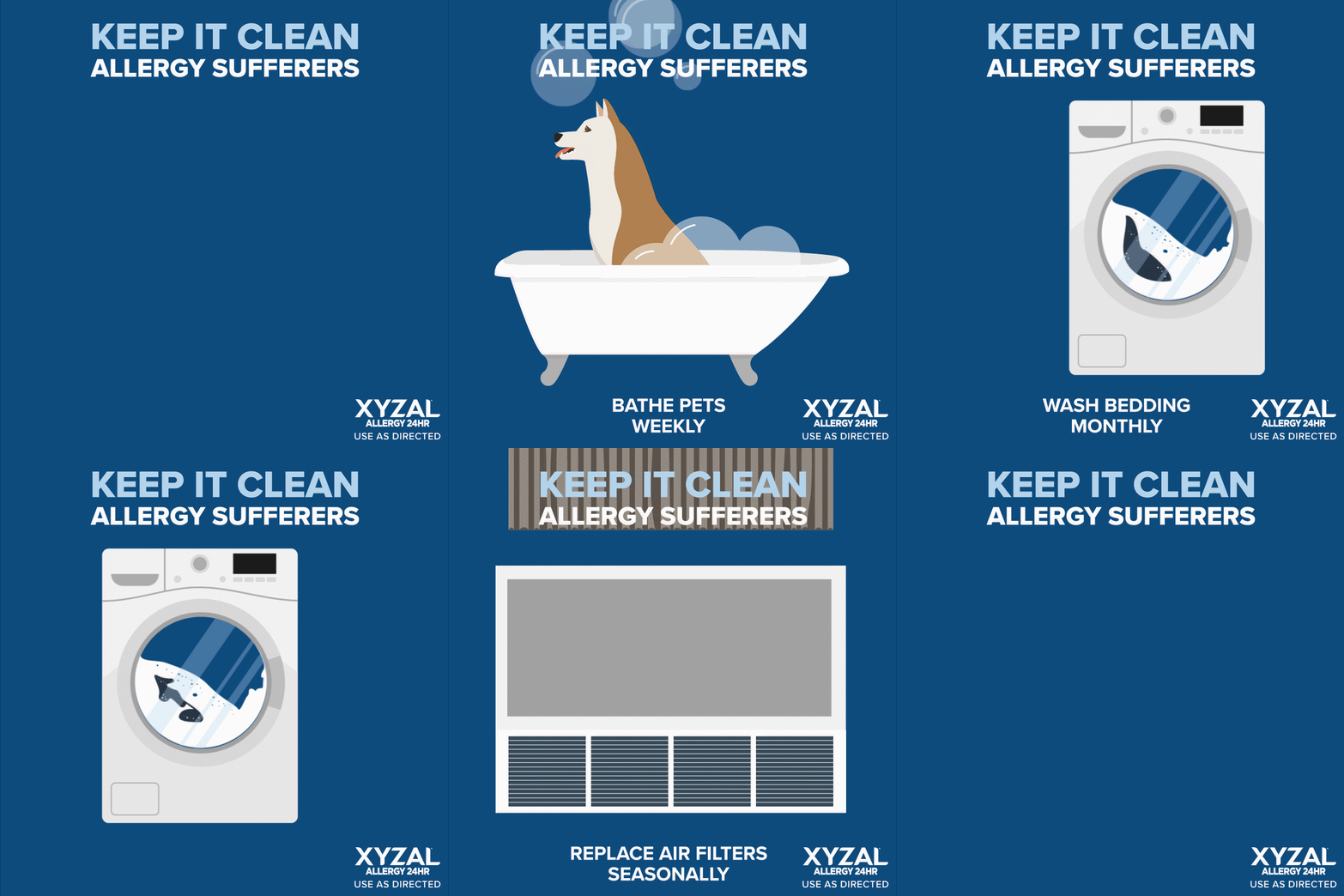
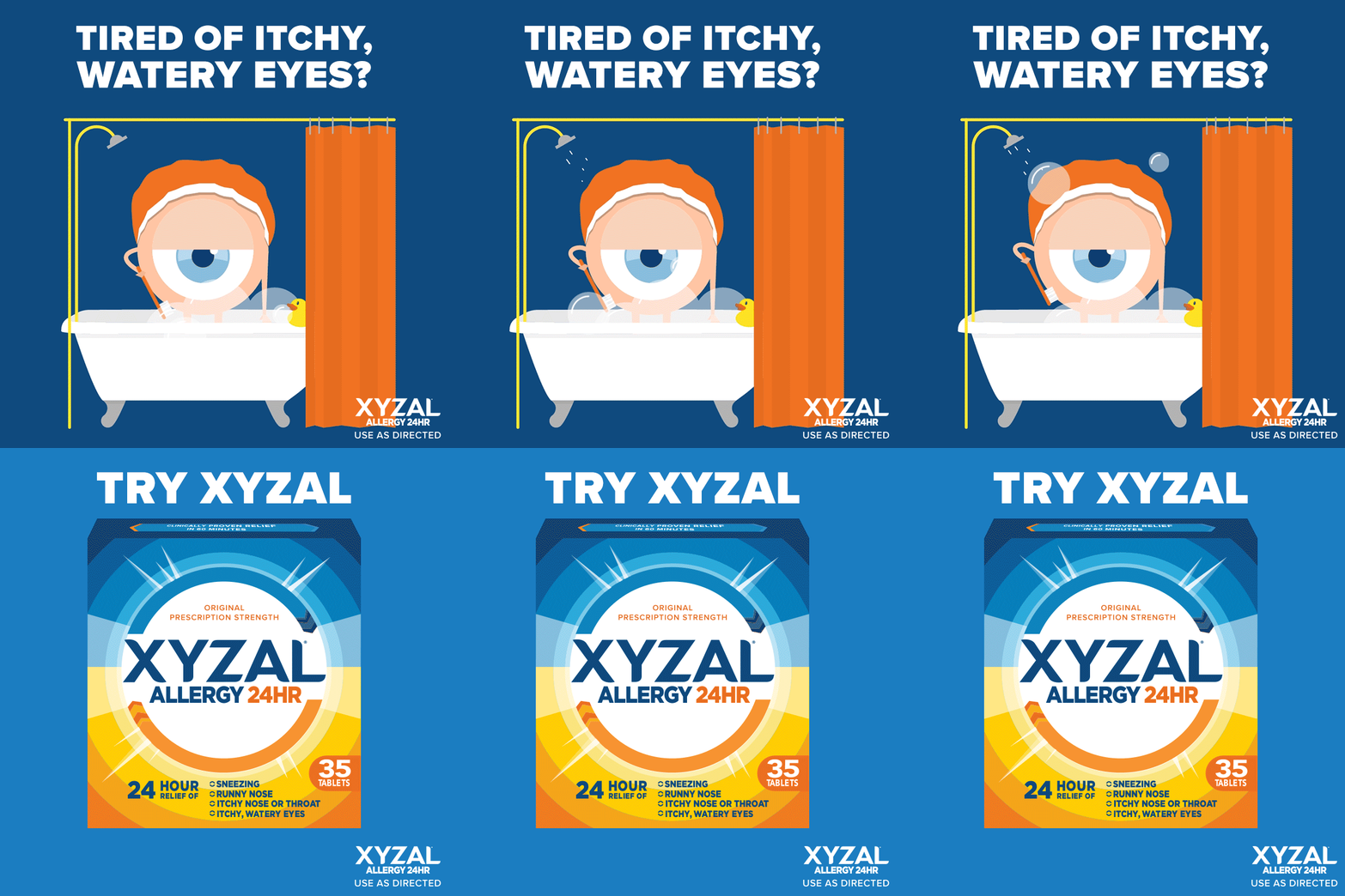
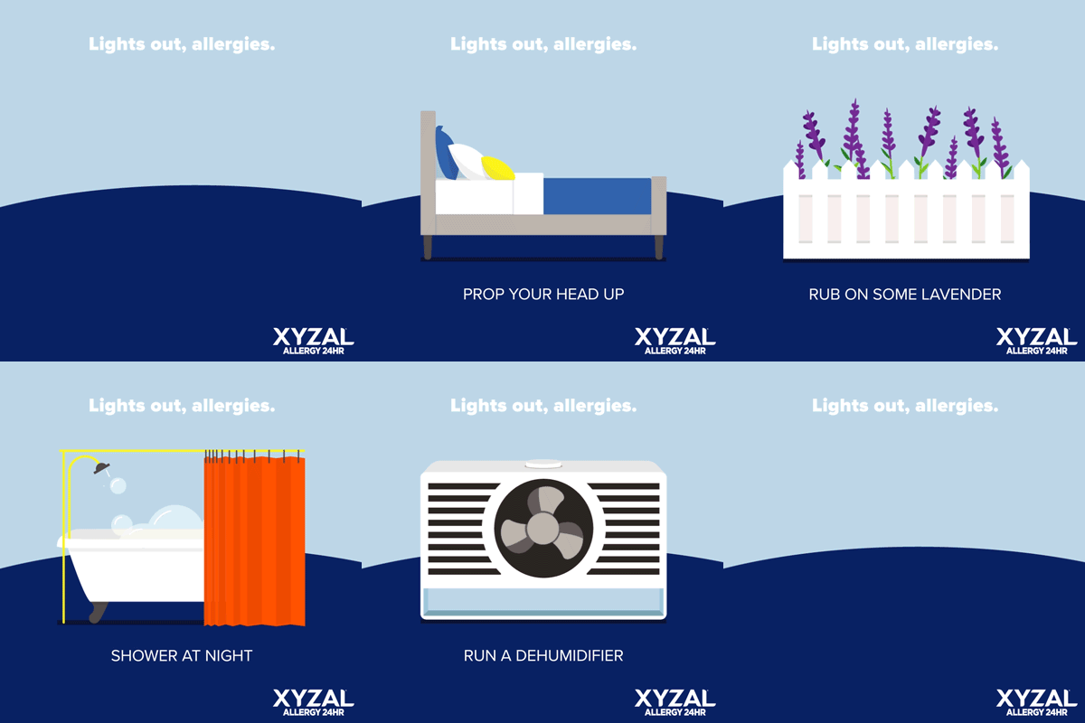
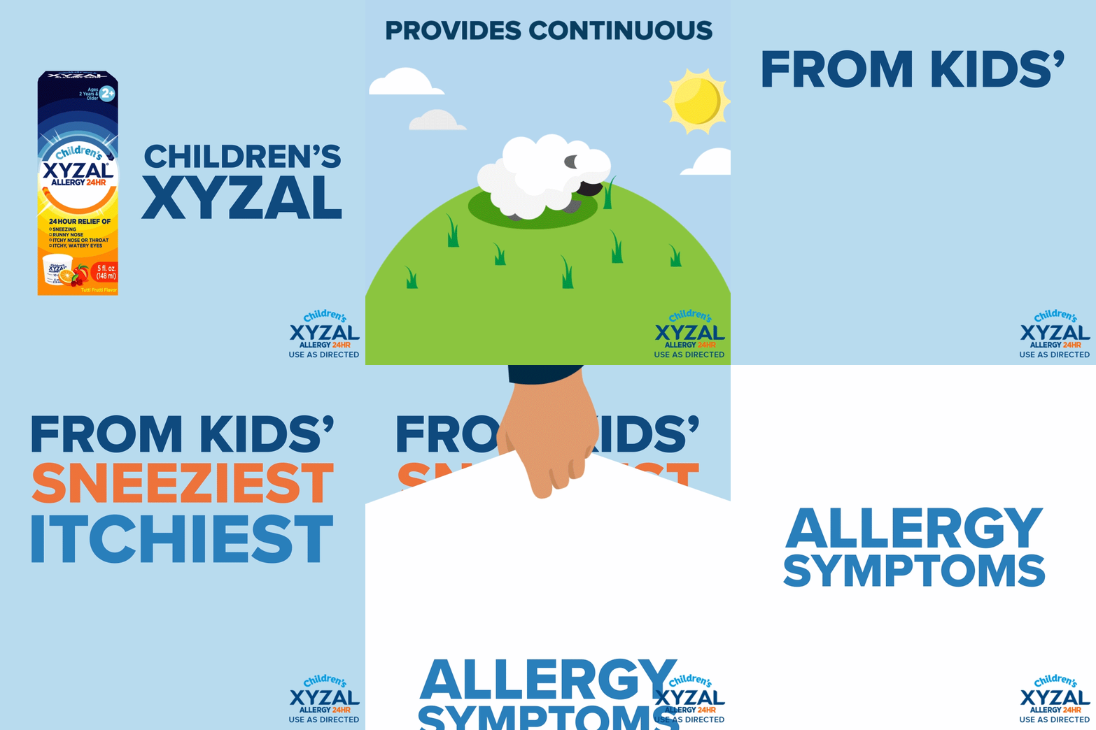
Initially, we used stock images, but they blended in with competitors' campaigns. To stand out, we shifted to custom illustrations paired with witty humor, bringing allergens and symptoms to life in creative ways. As the art director and illustrator, I took the lead on this approach and dedicated time to mastering After Effects, incorporating motion graphics to enhance the overall impact.
